
A Mechanical Romance
Develop a Bladerunner inspired Cyborg image from a Photograph using digital painting techniques
Get resource files on my patreon page here:
http://www.patreon.com/fantasio
- A Video recording from the design/conceptual development Steps can be found as reward on my patreon page
In this tutorial you´ll learn how to utilize one single standard brush, your digitizer tablet or pen-display and digital painting techniques in Photoshop CS6, to create a mechanical looking female cyborg image. It is recommended to have good experience with drawing on a graphic tablet and brushes in Photoshop to follow the tutorial most effective. The inspiration for this work comes from contemporary game concept designs such as Mass-Effect, but also the movie Bladerunner, whose visual language definitely had an impact on many artists of all ages and the look shaped a very own, timeless idea of Science-Fiction. Photoshop is the tool of the trade, because it´s great to have photo-editing tools next to digital painting equipment. Prepare yourself to get your hands dirty, break the mold and leave your comfort zone!
Flirting with a Robot
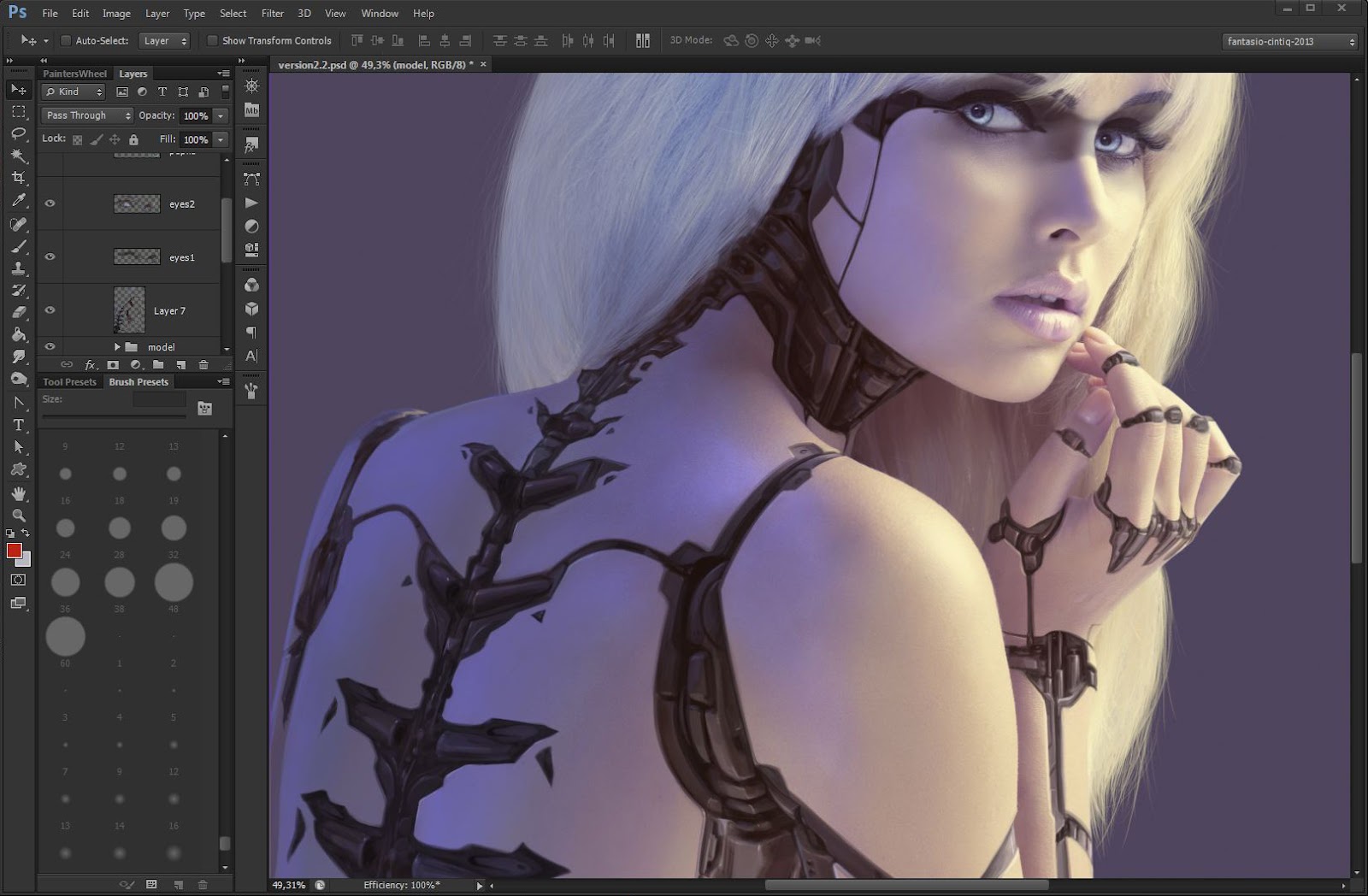
Make her stand alone

Getting wild with shapes

Machinist´s alchemy
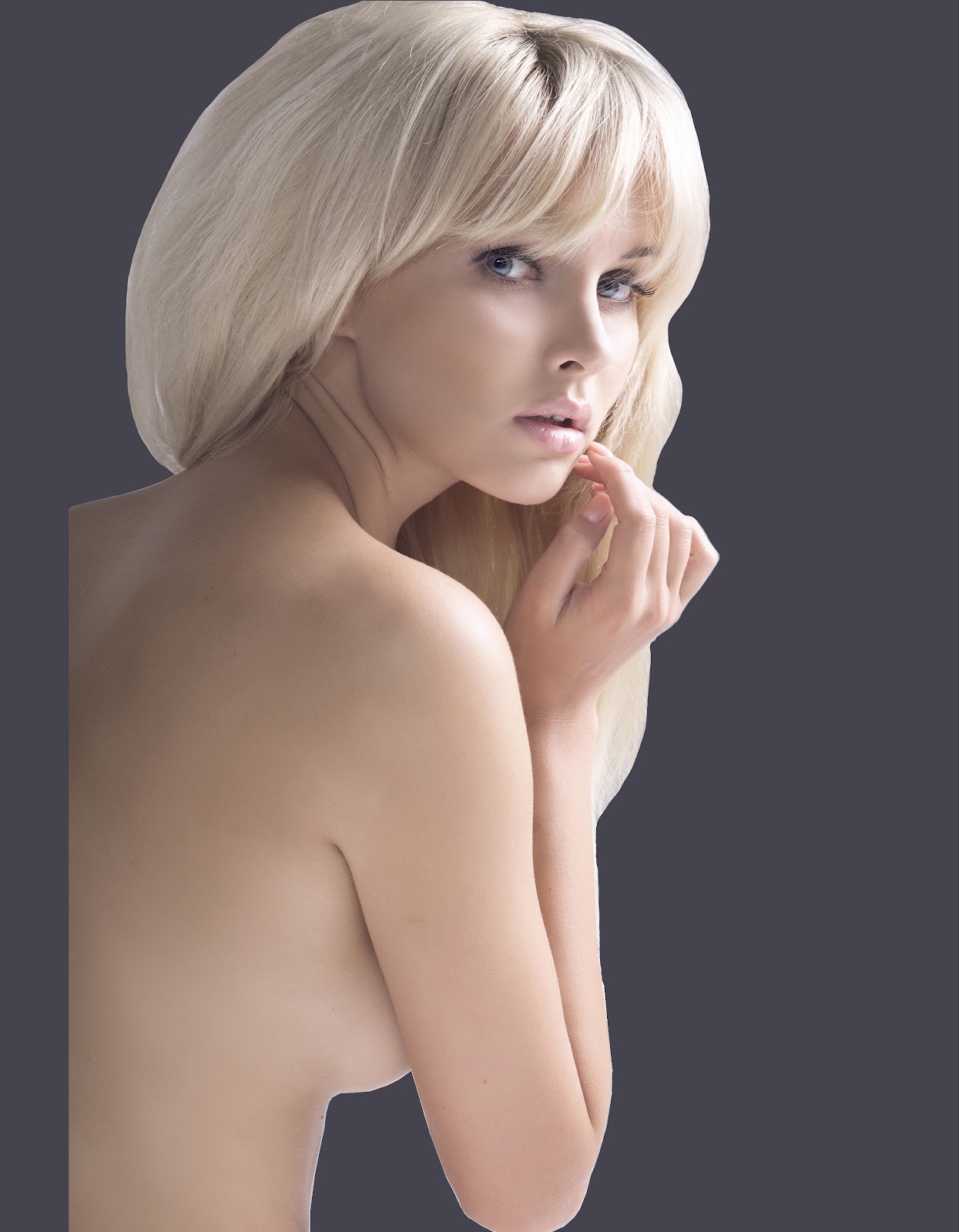
I stand alone
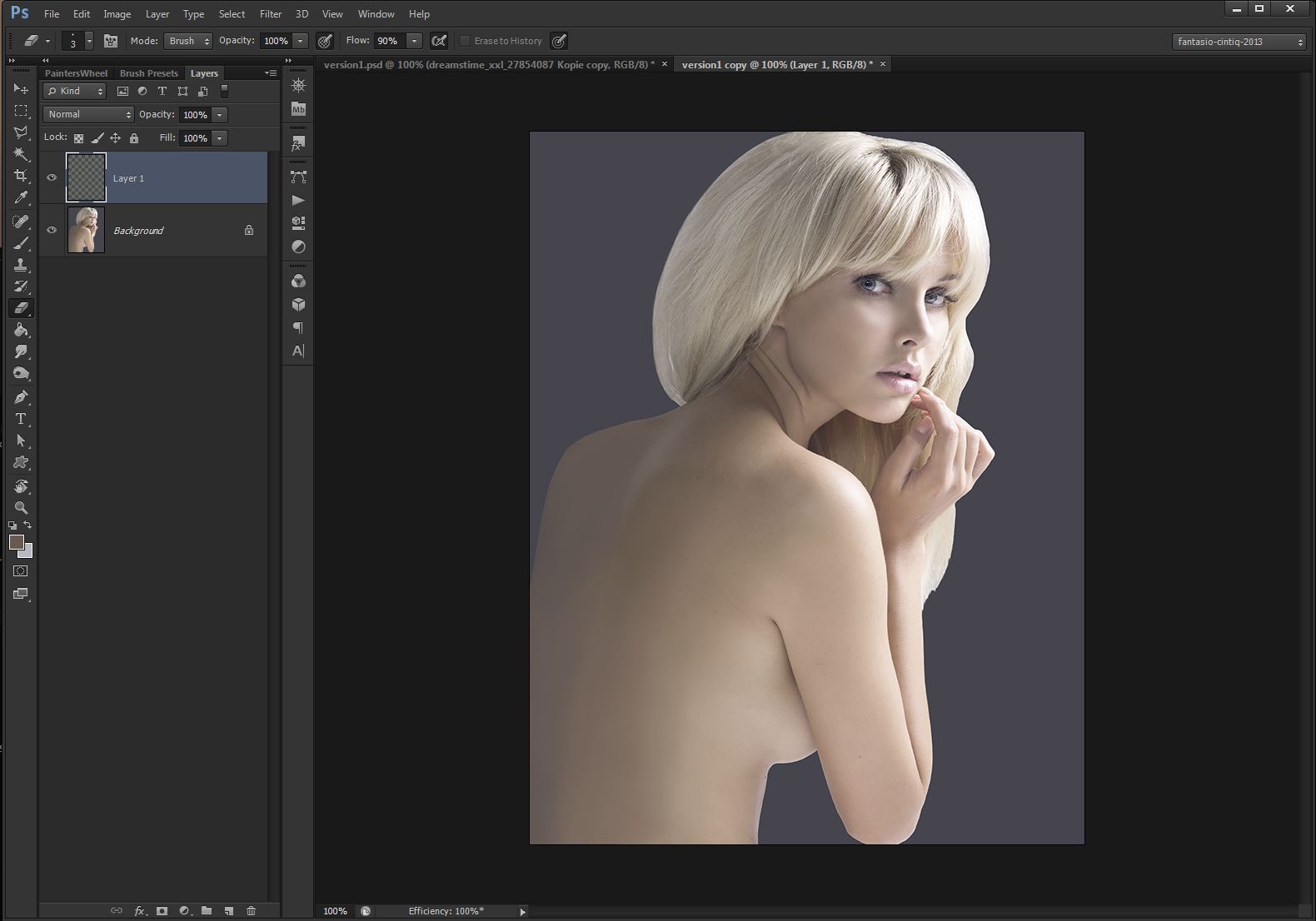
First, I remove the background. Use the polygon lasso and do a rough selection around the edges. It is not necessary to refine the selection or to keep strains. The silhouette of the model will change through the process, the hair will be painted later. I fill the background layer with the color #45434e, a non-distracting gray with a cold hint, using the fill tool.
Send chills down her spine.
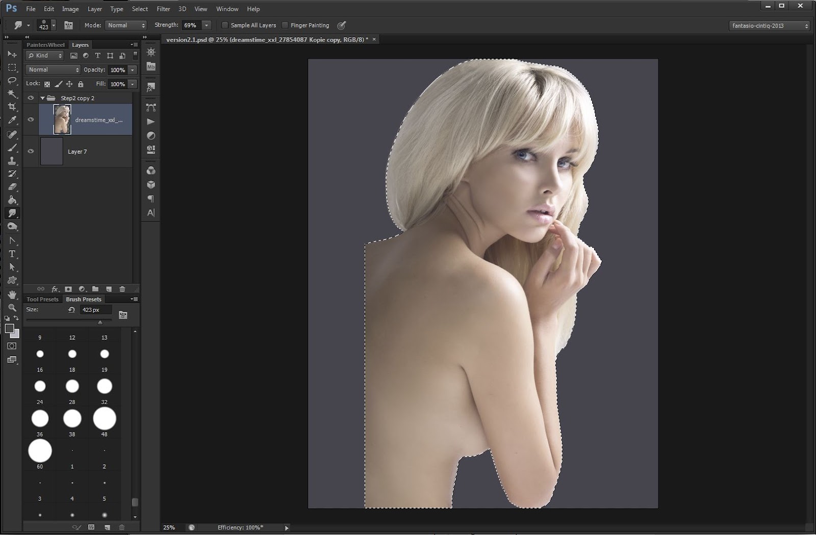
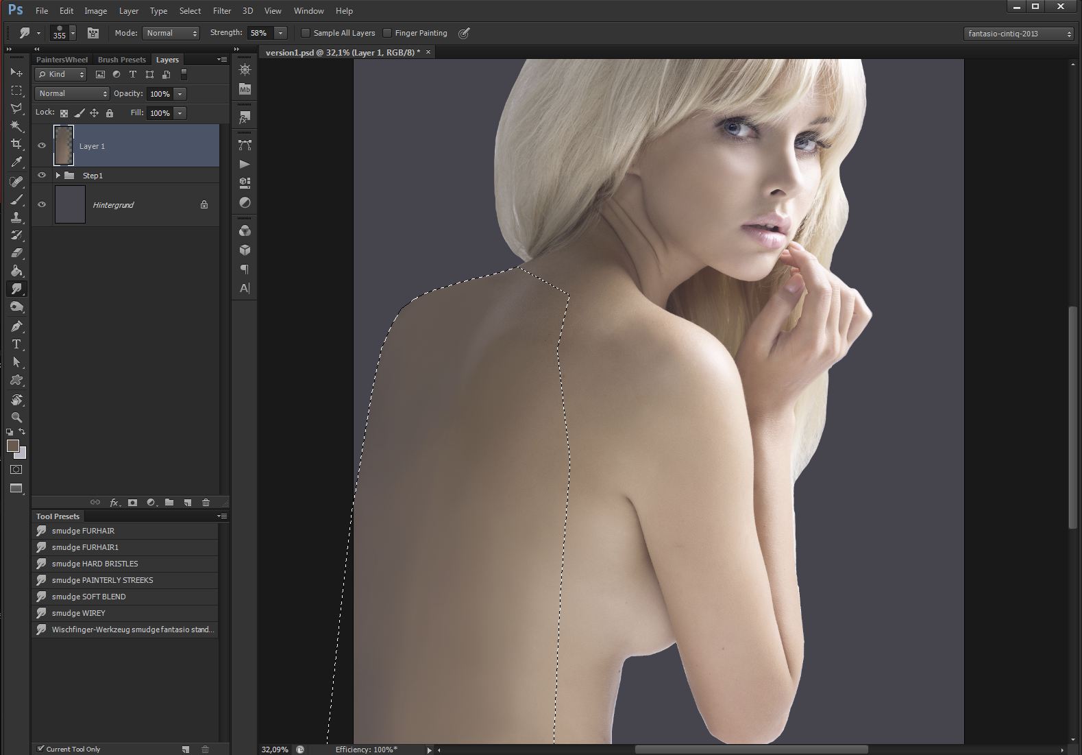
Create a new layer. Place the model in the center with the arrow tool. With the polygon lasso I define the masking area where the back will be enlarged. Choose a big (50-150 px) round-brush set to 70% opacity. Begin by picking existing skin-colors with the eyedropper tool (ALT) and paint rough blocks of color in the defined area to match the skin as close as possible.
 Reframe in the membrane
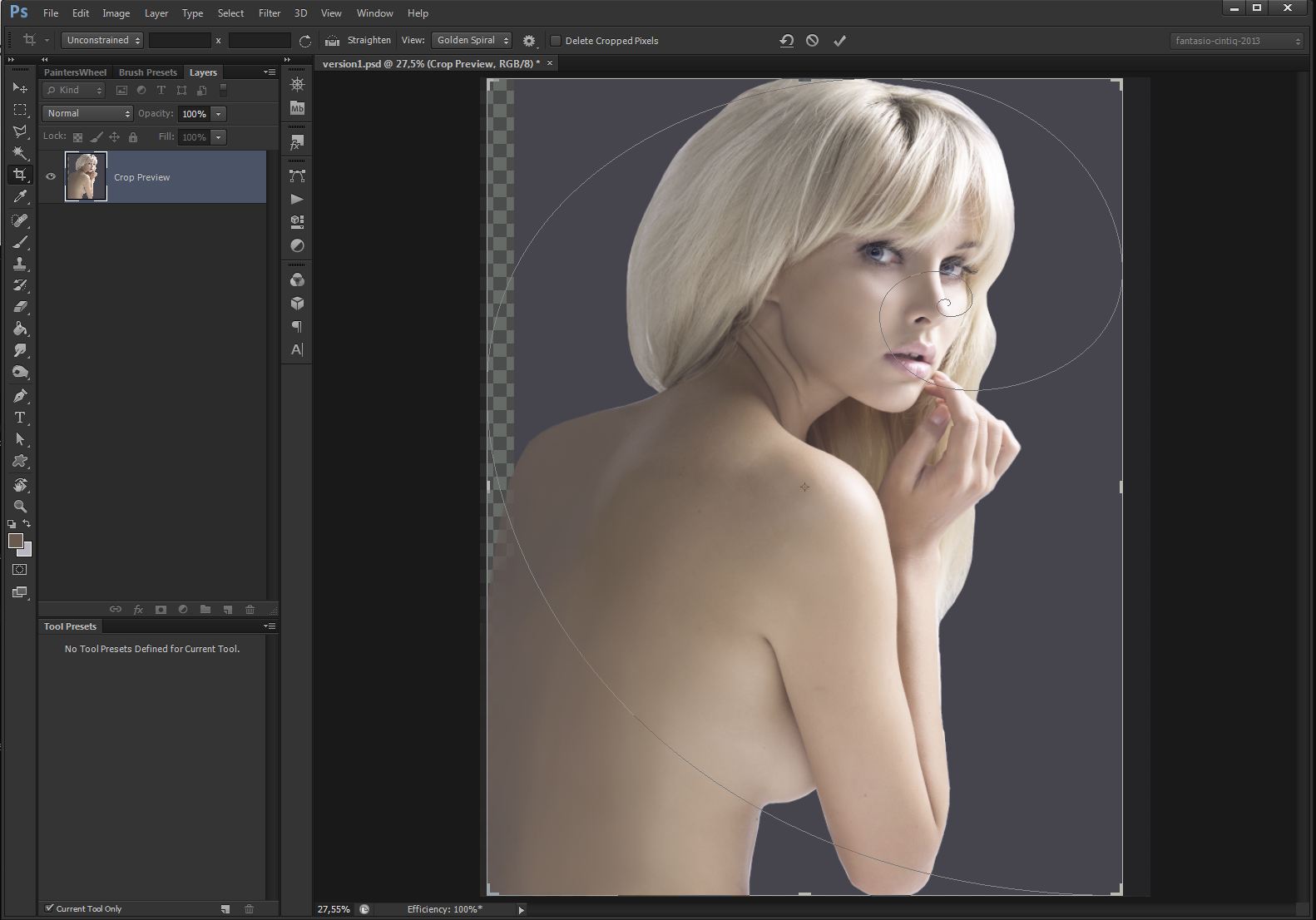
Before I proceed, I want to get the best out of the composition through cropping. When I press C in Photoshop CS6, the default view in the context menu of the cropping tool is rule-of-thirds, change that to the golden spiral, you´ll notice the spiral which appears when I move the image in cropping mode, I can place the nose in the center of the golden point.
Prepare to retool
From the drop-down menu of the Brush-Presets Panel, I choose the Basic-Brushes, (agree to append). Pick a 13 px sized, hard mechanical round brush and change it to the following brush settings:
- Roundness 56%
- Spacing 20%
- Hardness 65%
- Shape dynamics: size-jitter-control: pen pressure
- Shape dynamics: angle jitter: initial direction
- Noise - checked
- Smoothing - checked
- Opacity 80%-90% /Flow 100%

After that is done you can save your brush to your collection so that you find it easier. Some practice with these brush settings and your tablet device is recommended before proceeding
Move to the edge of your seat
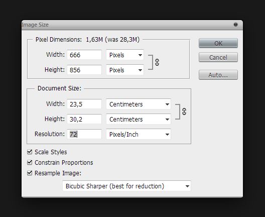
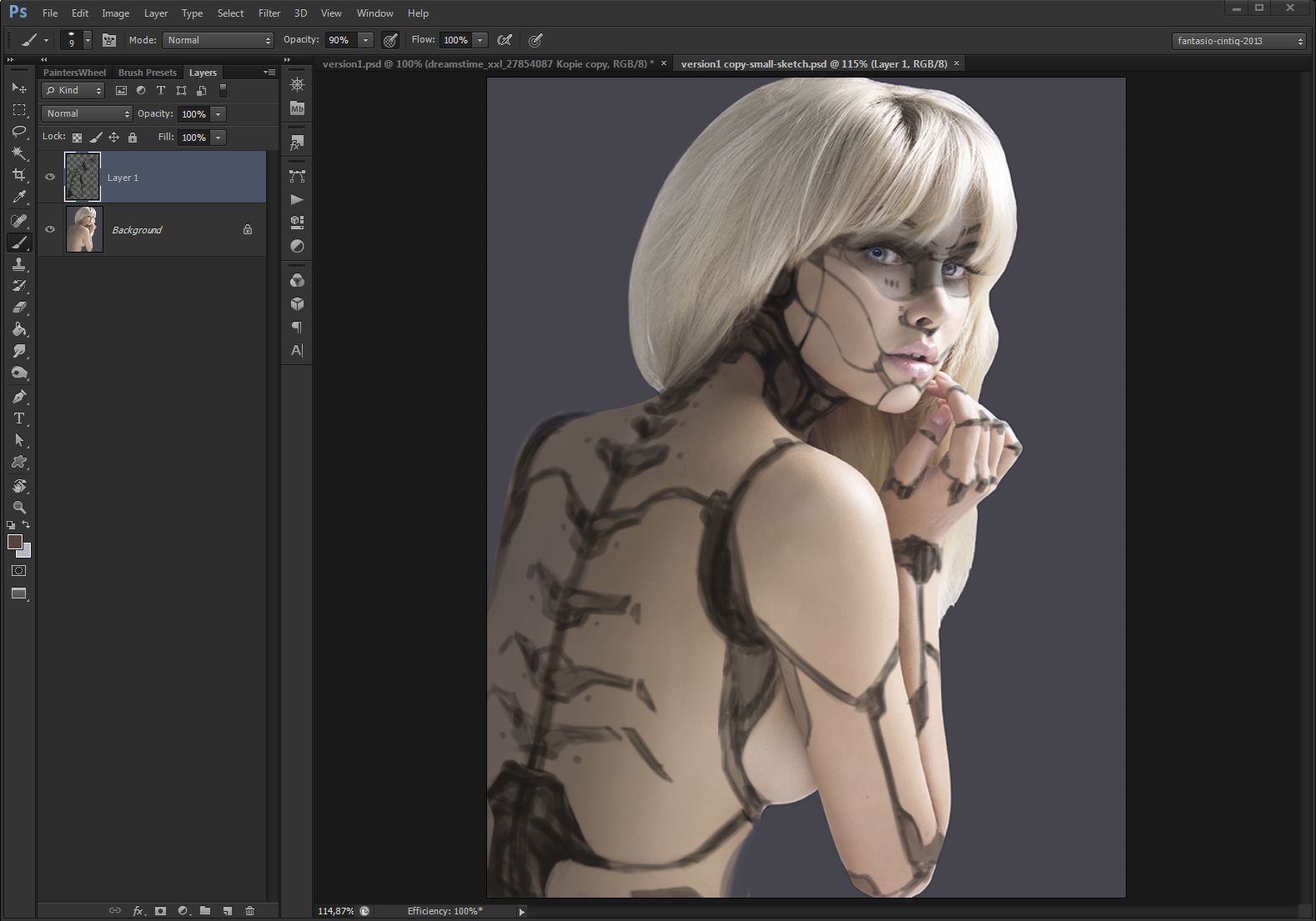
I clean the edges of the previously cut-out model with a soft eraser (2-10 px). When finished, duplicate your existing, layered image, (Image->duplicate) flatten it (Layers->flatten) and change the size from 300 DPI to just 72 DPI (Image->Image Size). This prevents to get lost in details upfront. Similar to a thumbnail-sketch, this technique allows you also to decide if a stock-photograph is worth a purchase, because if your initial design looks promising in the small version, chances are good that your design will work in a full resolution as well.

Get your hands dirty
In 72 DPI size, you can´t get into much detail. If you take on the challenge to draw a design by yourself, just use a round-brush set to 70-80% opacity and pick up a 80%-90% black color to draw your design. Transparency allows for a welcome overlapping of edges and keeps the underground color to shine through. The latter is important to pick up a variety of correct values to build a working design.
Entreat her to the Color Lookup table
Back in our initial version, the 300 DPI file, I pick the arrow tool and move the technical draft of the 72 DPI version back into our large version. Adjust the size to fit the model with the transformation tool. Since I am going to paint details in there, the interpolation is a welcome effect.I set the mood for the following painting work by using the Color Lookup-feature in Photoshop CS6, which can be found in the adjustments panel. Choose RedBlueYellow from the Device-Link menu to get the effect used in this tutorial.
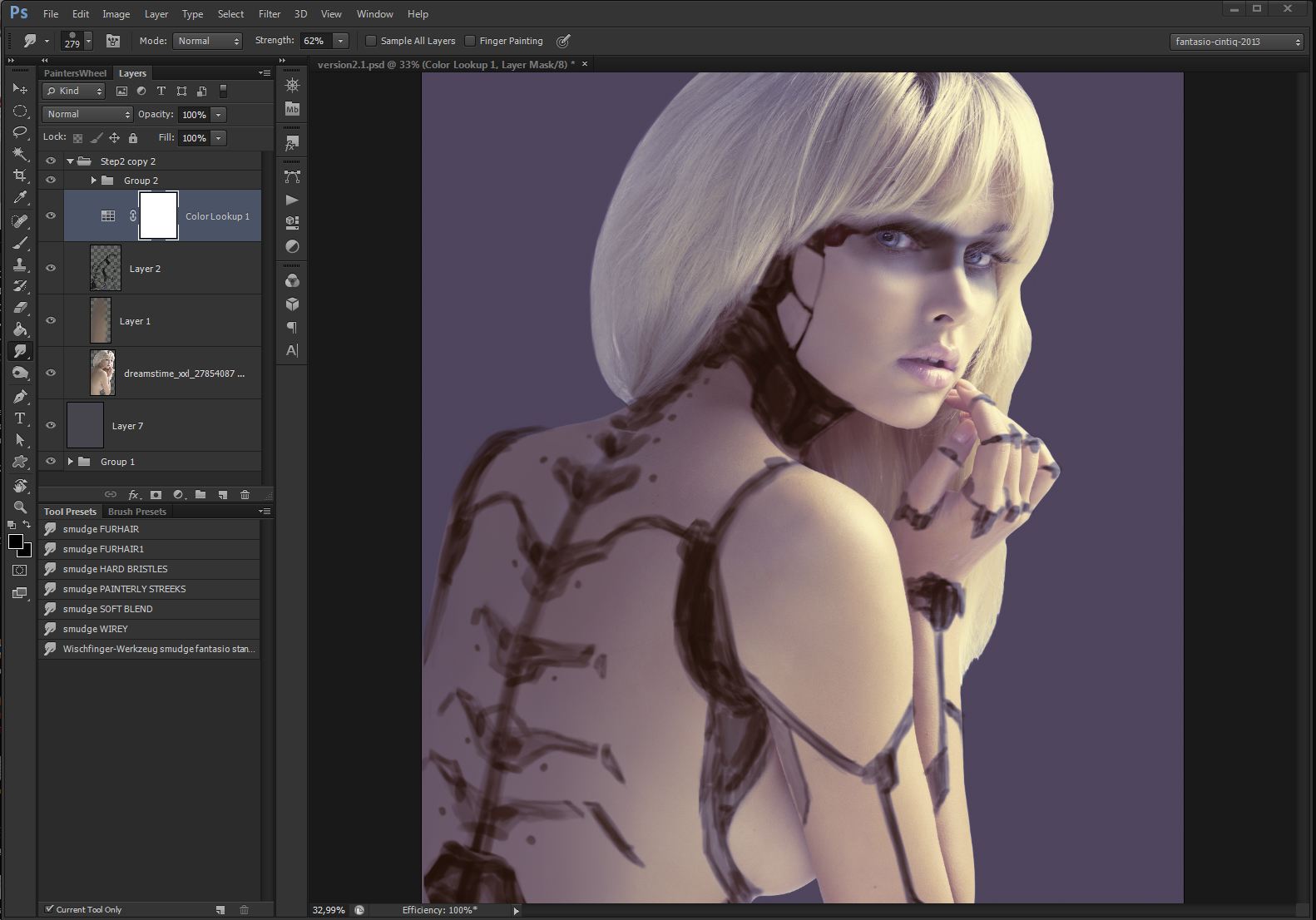
Moody lighting
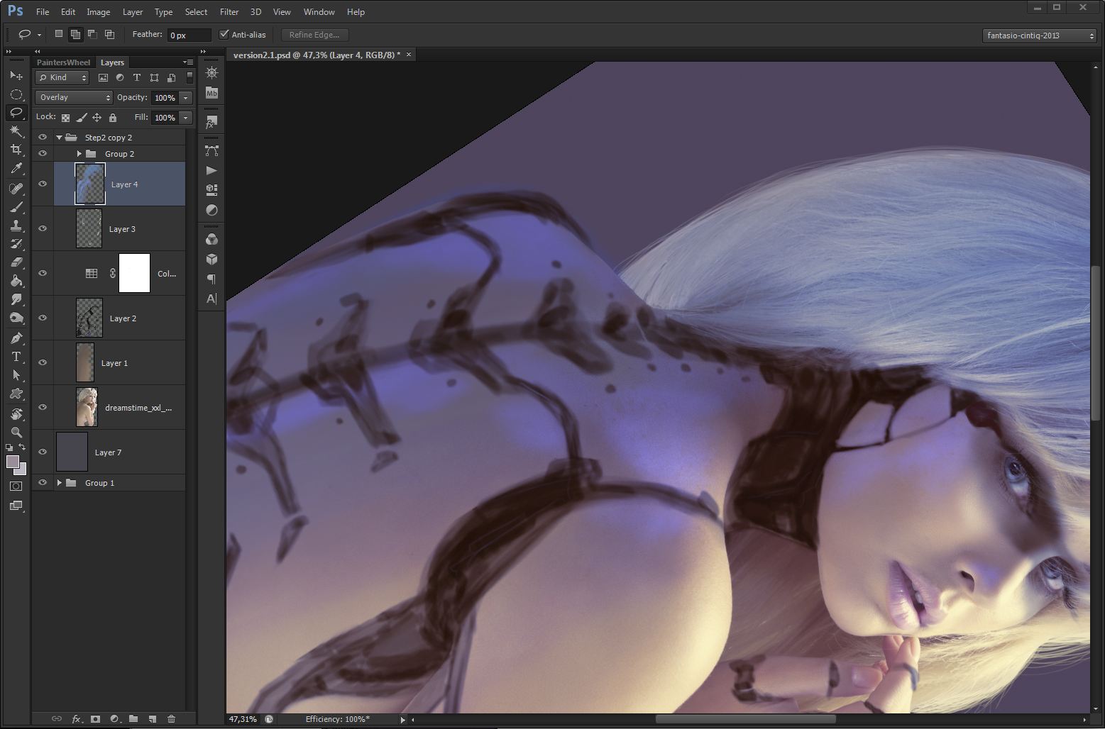
Since I have no different photograph with a different lighting setup to choose from, I can only do a limited change here. To relight our scene I add a new layer and set it to Overlay. With the use of a tablet I paint on that layer using our round-brush with 50% hardness (50-150 px) and set to 90-100% opacity. As color I pick TOYO 0457 from the TOYO 94 Color Finder swatches that accompanies your Photoshop installation.
A Final Quick Tip
Thumbnail sketching advice: If you find it hard to get a design draft laid down, try working in a small, thumbnail sized format, screen size at 72 DPI. It is by far the most undervalued advice that saves professional working artists a lot of time at the very beginning of any given project.
Contemplate hairdresser as a new profession
Painting the hair allows us to have full tonal control over the silhouette of our model. By painting instead of using masking techniques, it is vital to understand that it is not just colors that I pick up and draw. Instead you should understand that it is a 3-dimensional colored object and our drawing efforts have a direct impact on the outcome. Even at this stage.
Painting the hair allows us to have full tonal control over the silhouette of our model. By painting instead of using masking techniques, it is vital to understand that it is not just colors that I pick up and draw. Instead you should understand that it is a 3-dimensional colored object and our drawing efforts have a direct impact on the outcome. Even at this stage.
Something special about her hair
Work with a standard round brush (3-10 px), pick colors from the existing hair areas with the eyedropper tool.To get a realistic look after the first pass, I use the following trick: set the round brush to around 83% Scattering (3-6 px) and paint over the existing hair. Additionally draw some random strains.
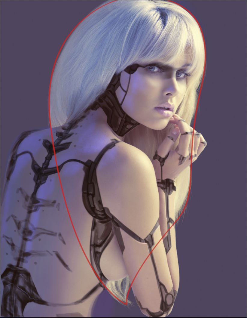
This photograph invite us to play with the hair outline, is this correctly done, it gives the viewer an easy shape to follow. See the red marked outline for reference. Although this is just a secondary composition element, it is useful to search for such opportunities in existing imagery and bring it to attention.
The power of loose masks
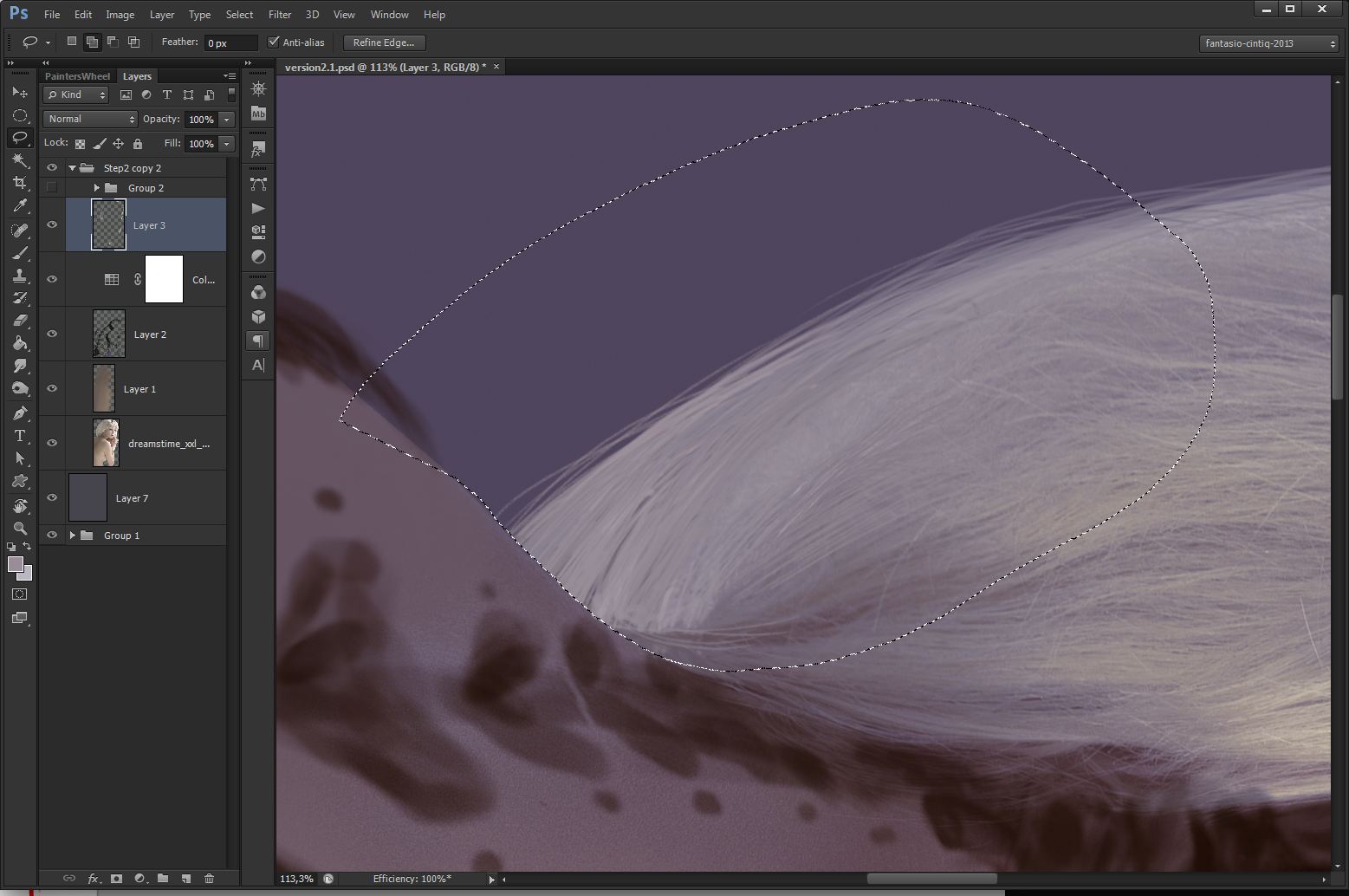
On edges where the hair crosses the skin, I can loosely use the lasso tool or the polygon lasso tool to depict this area. Painting in this selection makes sure I won´t overpaint unwanted parts of the layer. with CTRL+SHIFT+I I can invert the selection to paint on the edge from the other side to add shadows without painting over the hair.
I highly recommend using the TOYO 94 Color Finder swatches, that accompanies your Photoshop installation, for digital painting.
Keen observation pays off
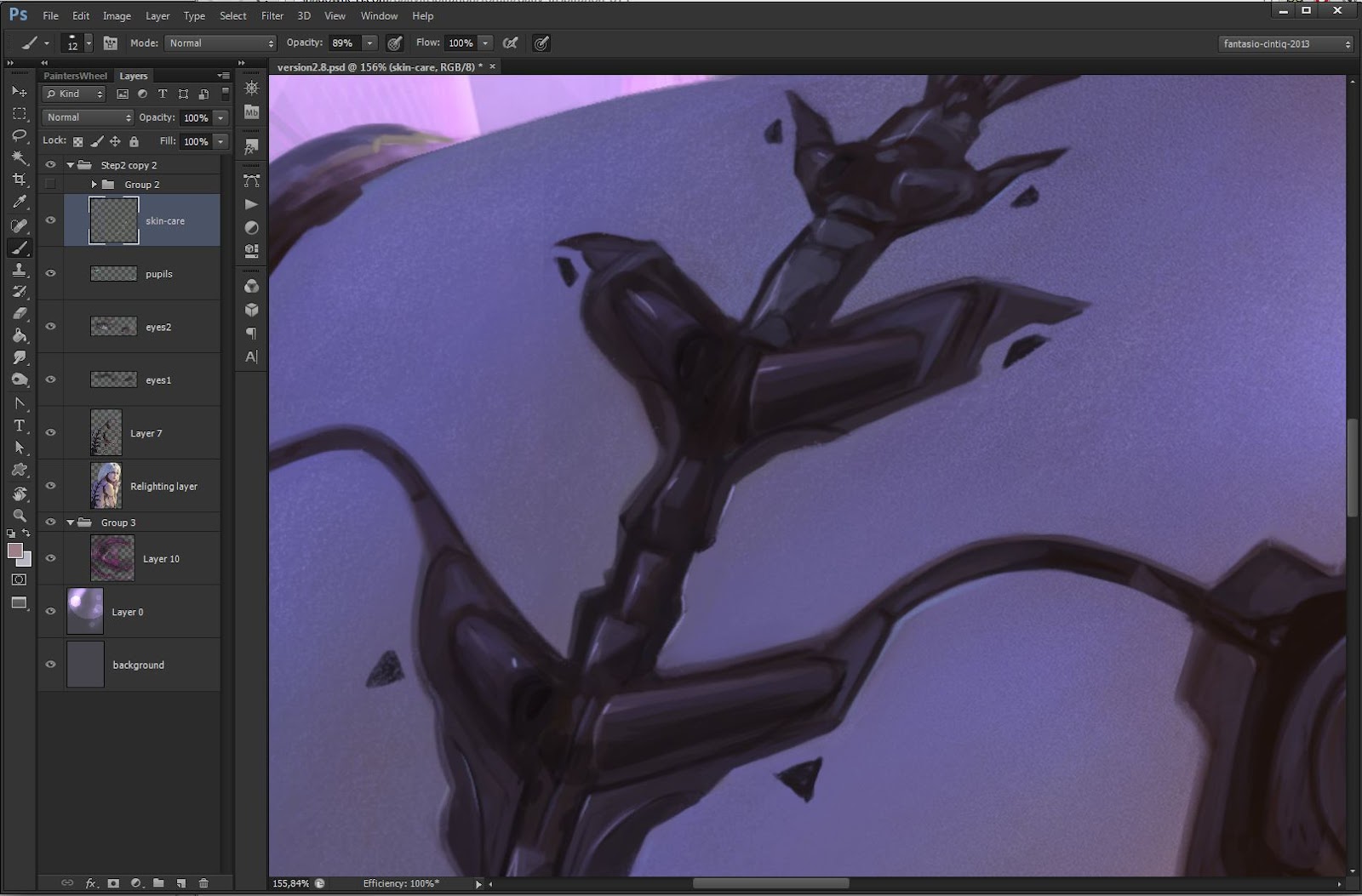
Being tech-savvy is not a necessity but having a good understanding of all things technical can be a really useful asset for the following three steps. In the video recording, you´ll find out how to do the painting of the technical parts. The design-process from the thumbnail-stage in Step-06 will now be worked out into greater detail by using a 80%-90% Black on a new layer. This is the most time consuming aspect but the one that decides over the authenticity of the final image.
Let us see her stripped
Still shaping the underlying mechanical parts.Through the dark color draft I applied in the sketch-phase, I have accurate values to work with. I just change to darker tones for shadows and brighter values for highlights using the HUD-Color Picker (ALT+SHIFT+RIGHTCLICK / ALT+OPT+CMD). If you decide to bring in your own design, study construction equipment and robots. Books and movies as a reference are allowed too. If you start from bold big shapes towards smaller ones you´ll find it much easier to show what´s under the surface. Imagination is encouraged.
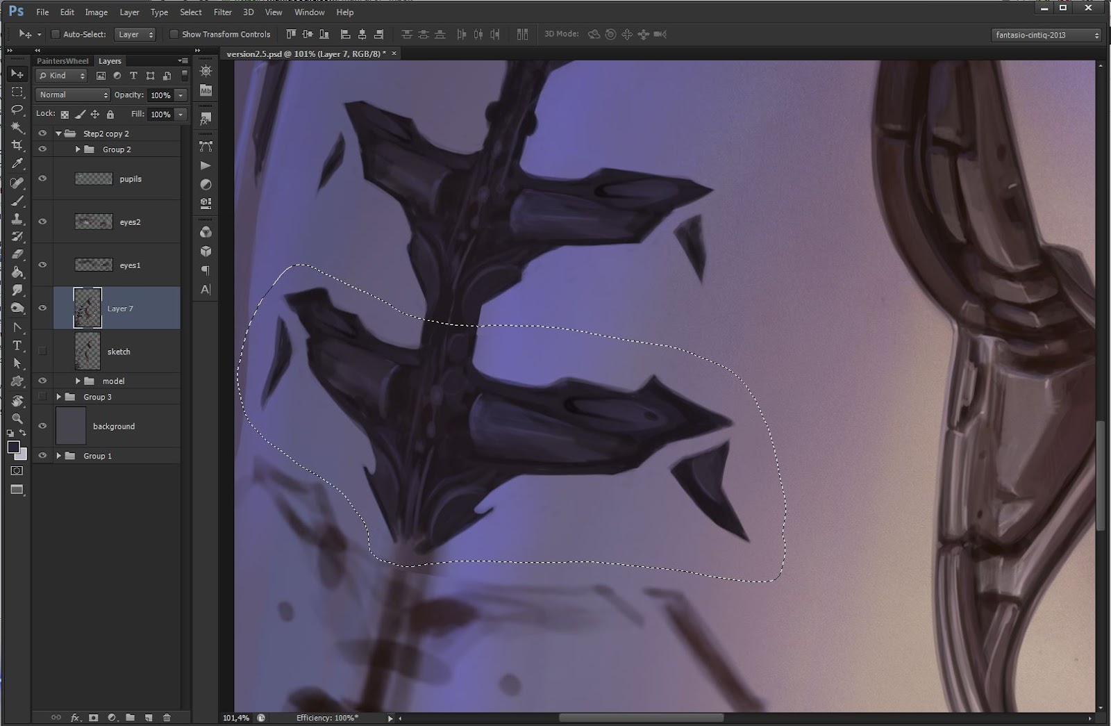
Let the hours pass
The spine on the back is the trickiest part. While it is painted exactly the way the other design elements were done, with a standard round brush, one successful applied pattern can be repeated and varied by using “copy-and-paste”. You basicall bash your own design. Select one finished part with the lasso tool first and place it below the source. Transform it according to the sketch by using the warp-tool (Edit->Transform->Warp). Pick up colors with eyedropper tool and play around with an eraser and shapes in the appropriate area and move on to the next one, rinse and repeat.
Scared to look in her eyes?
The eyes are the most important part of any portrait related composition. Our composition leads the viewer directly towards the eyes so I need to make sure they´re worth looking at. I do this by adding a new layer and paint dark values with 80% Black color. From there I can paint the eyelid darker, while I´m in this area, some distracting strains of hair can be overpainted. It appears as if her right eyebrow is missing, I can fix this with a small round brush too.
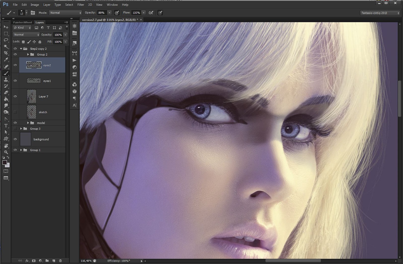
Bright eyes
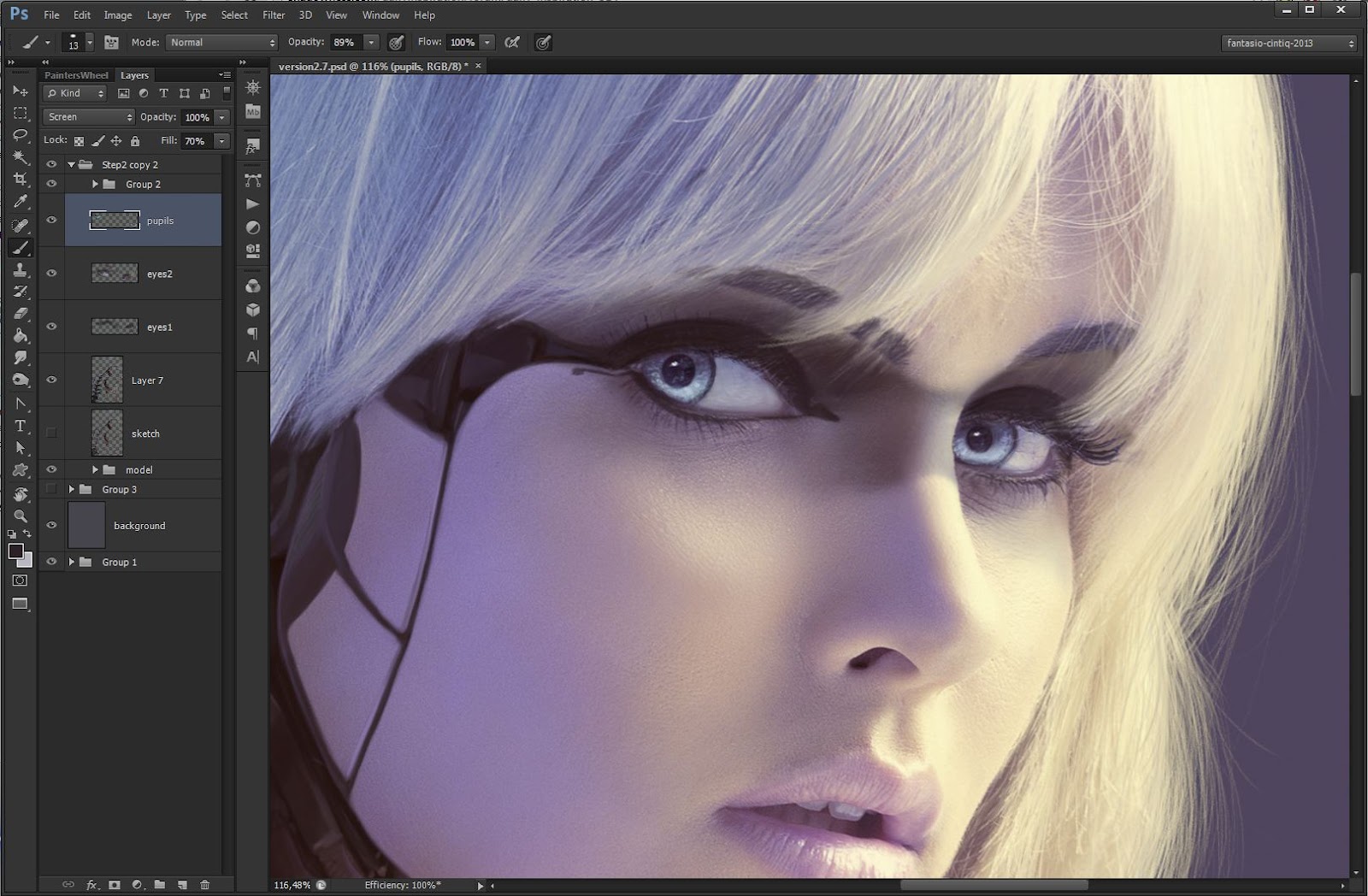
The pupil deserves a special attention as the eyes were pre-edited in a weird way. I draw the pupil round again using a small round-brush (2-4 px). With the stamp tool I clone the texture from the left eye into the right one including the specular highlight. I can now duplicate the iris/pupil area by selecting it with the lasso tool. With CTRL+SHIFT+C and CTRL+SHIFT+V I copy through all layers. With a bright Blue, nearly White color, I paint some texture to make the eyes appear brighter.
Quick tip: Brushes and HUD-Color Picker
Since this tutorial is done using a Standard brush, it´s highly recommended to get familiar with the brush settings dialog (Shortcut F5), for the scattering on hair and skin. Another great helper is the HUD-color Picker, (ALT+SHIFT+RIGHTCLICK / ALT+OPT+CMD) which allows you to choose colors on the fly.
About the technique
It isn´t possible to lay down a concrete sketch to fill out. The challenge is that everything has to be painted from imagination, from rough shapes seen in a blurry sketch. Daily drawing practice will help you to get better at this. There are some great schools, such as Feng Zhu, specialised in training of concept and industrial design (http://www.fengzhudesign.com/school.htm)
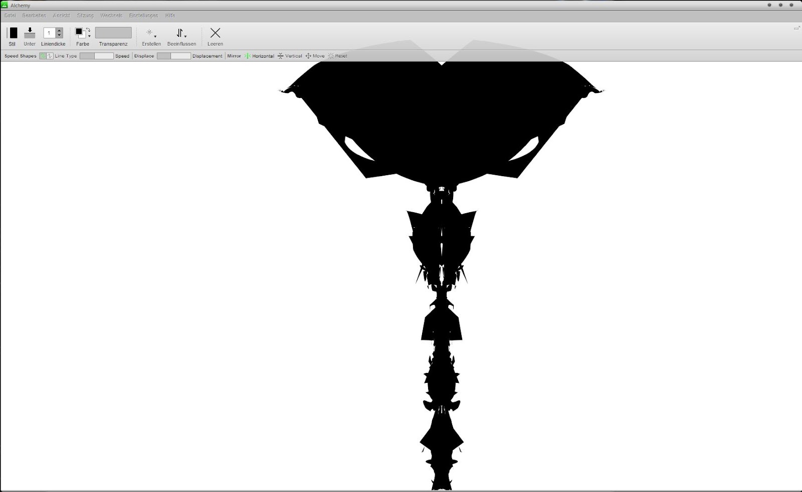
Besides mastering the technique, it is vital to train your imagination daily,foster a habit to see things in the clouds and trees. A great tool to challenge your imagination is Alchemy (http://al.chemy.org/)
Besides mastering the technique, it is vital to train your imagination daily,foster a habit to see things in the clouds and trees. A great tool to challenge your imagination is Alchemy (http://al.chemy.org/)
Crying at the Discoteque
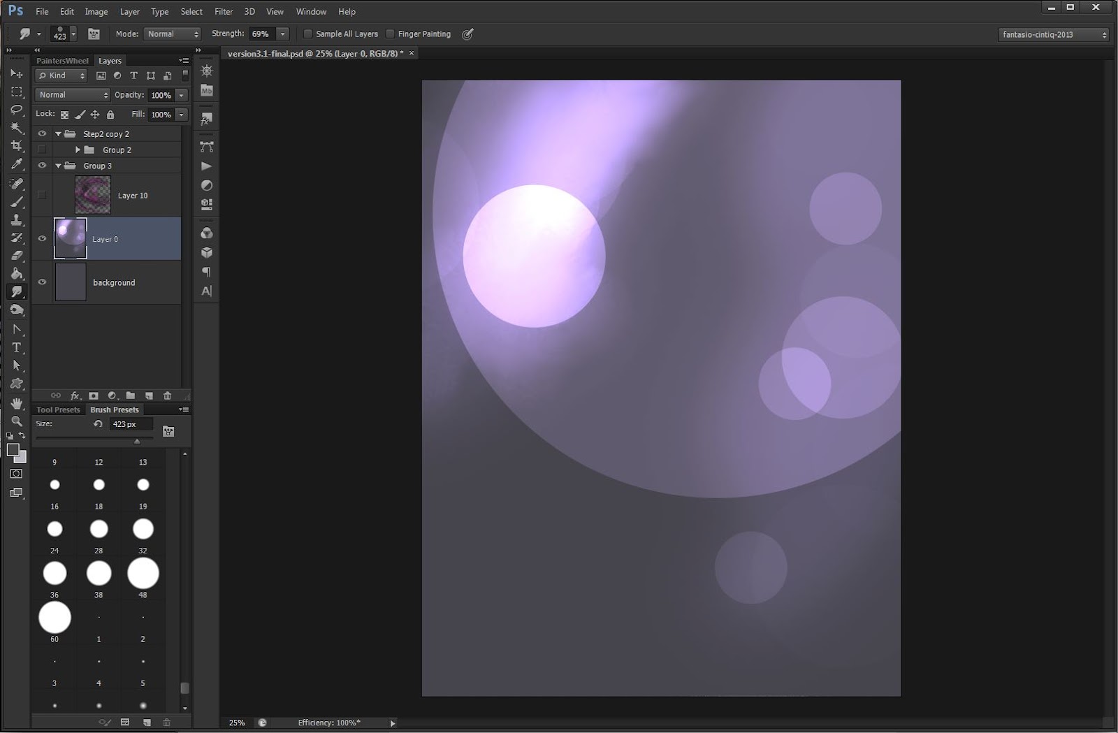
Turn visibility of all layers related to the model off. Select the existing background layer and pick the color TOYO 0469 from the TOYO 94 Color Finder Swatch. Set Opacity of your brush to 80%, Flow to 40% and mode to Color Dodge. Roundness of our brush should be set back to 100%. Now add some random spots with mouseclicks, ranging from 500 to 2900 px size. On some occasions it needs two or more clicks to show effect. The Pseudo-Bokeh effect should stay decent in the back, less is more.
Driving her crazy
For the synthetic, edgy looking background of the final version, I used a stock image. The 3D-rendering package containing that file can be downloaded for free from Media-Militia: http://mediamilitia.com/3d-renders/ Place the “image 4.PNG” exactly like in the screenshot. It is actually landscape format and looks different, I have to rotate it 90° clock-wise to match the look seen in the screenshot. Set the layer to Linear Dodge blending mode and set Fill to 80% to achieve the same effect. The Background with the Pseudo-Bokeh-effect should sit with 100% visibility underneath the stock-image.

Skin deep
Although the development of the image got forward pretty fast, viewing of actual pixels shows some disadvantages though. For a small, web-sized version it would be OK, but getting up close, I see the difference on the back, which I have roughly painted in Step-02.To solve this issue, I create a new layer, set the brush to scattering (1000%) and change the size to approx. 2-3 px. By picking up colors from the back with the eyedropper tool, it is possible to apply some of the bumpy skin texture by hand.
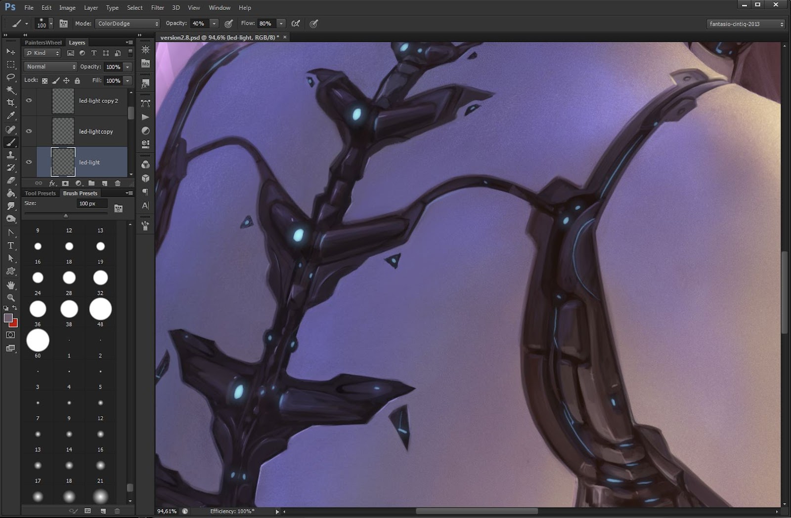
Shine your lights
For the LED-lights I add a new layer and paint with color TOYO 0687 from the TOYO Color finder swatch. Using our round-brush, I depict some spots that work as additional light. To add values and of course glow, I duplicate the finished painting layer, apply a Gaussian blur set to 2,8 px and set the result to Color Dodge blending mode. A second copy from this layer will get another dose of Gaussian blur, this time 8,5 px and layer mode set to Screen.
Side effects
For the lens-flare-effect on one LED of the back/spine, I use a stock image from Media Militia: http://mediamilitia.com/custom-lens-flares-pack-50-free-high-resolution-transparent-images/ Use the image 29.PNG set to blending mode Screen, 87% Opacity and 75% Fill. Position the center of the lens-flare over the LED light.
For an additional, synthetic look, I change the overall tone of the composition with a Photo Filter Blue set to 45%. For contrast I add a Gradient Map, Platinum from the Photographic Toning collection in Photoshop CS6, set this to Soft Light and 50% Fill.
For an additional, synthetic look, I change the overall tone of the composition with a Photo Filter Blue set to 45%. For contrast I add a Gradient Map, Platinum from the Photographic Toning collection in Photoshop CS6, set this to Soft Light and 50% Fill.

All that´s left are the final touches
Repositioning of the model, rim-light on the shoulder, color adjustments and some general, cleaning operations are in order now. I use the stamp-tool and our round-brush to do so. I also need to add some strains of hair on top, when adding room to the composition with the crop tool. I also change the coloring of the technical parts to a more gray, colder tone. I do this with Image>Adjustments>Replace Color by picking up the mid-tone of the brownish area and change saturation to around -15%.

Quick tip
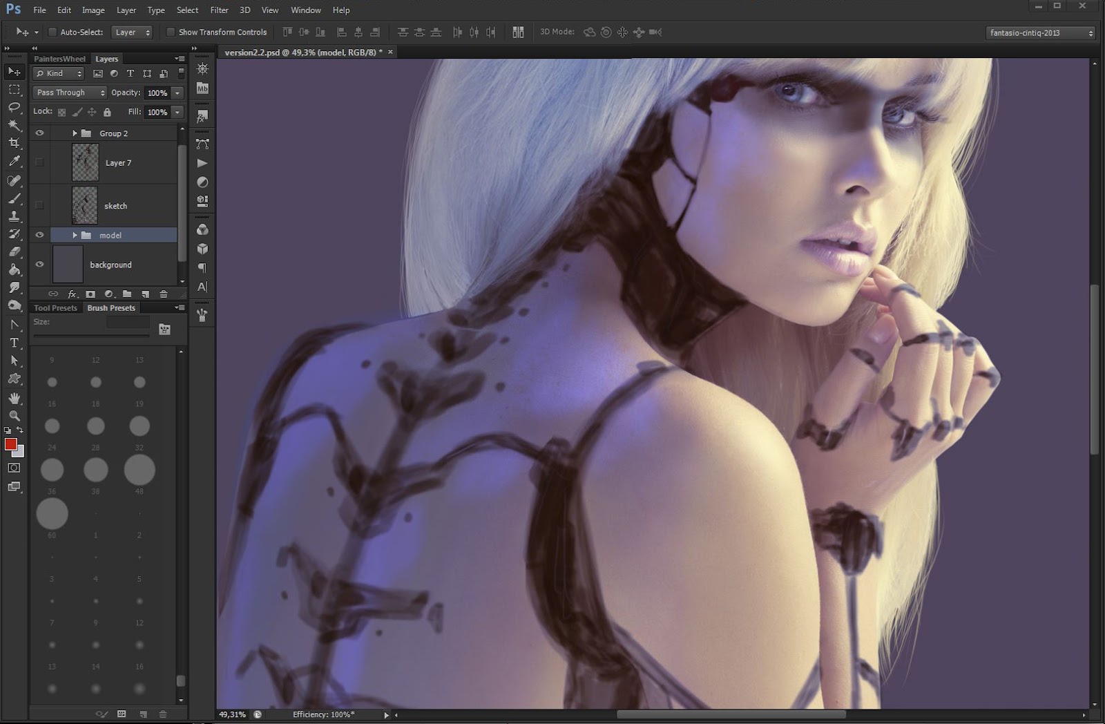
When revisiting a finished piece, it proves useful to have Layer Groups just for effects such as Photo Filters. Switch visibility of these groups off when working on underlying layers, this helps structuring your work.
If you work on top of these effects, your work gets useless once you decide to change coloring of your underlying effect-layer.
If you work on top of these effects, your work gets useless once you decide to change coloring of your underlying effect-layer.


0 comments:
Post a Comment